The Invisible Palette: Color Monotype Without Fear
Color in monotype is often treated like a dangerous guest: invited only after black-and-white mastery has been proven, handled with careful stencils and perfect registration. The result is beautiful, controlled, and sometimes lifeless. There is another path—one that treats color as weather rather than architecture.
The secret lies in accepting that colors will shift, bleed, and surprise you. Instead of fighting the chaos, you learn to dance inside it.
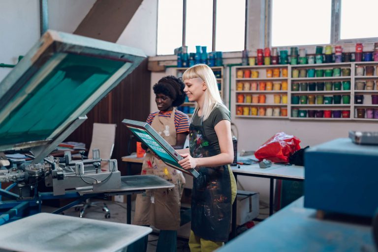
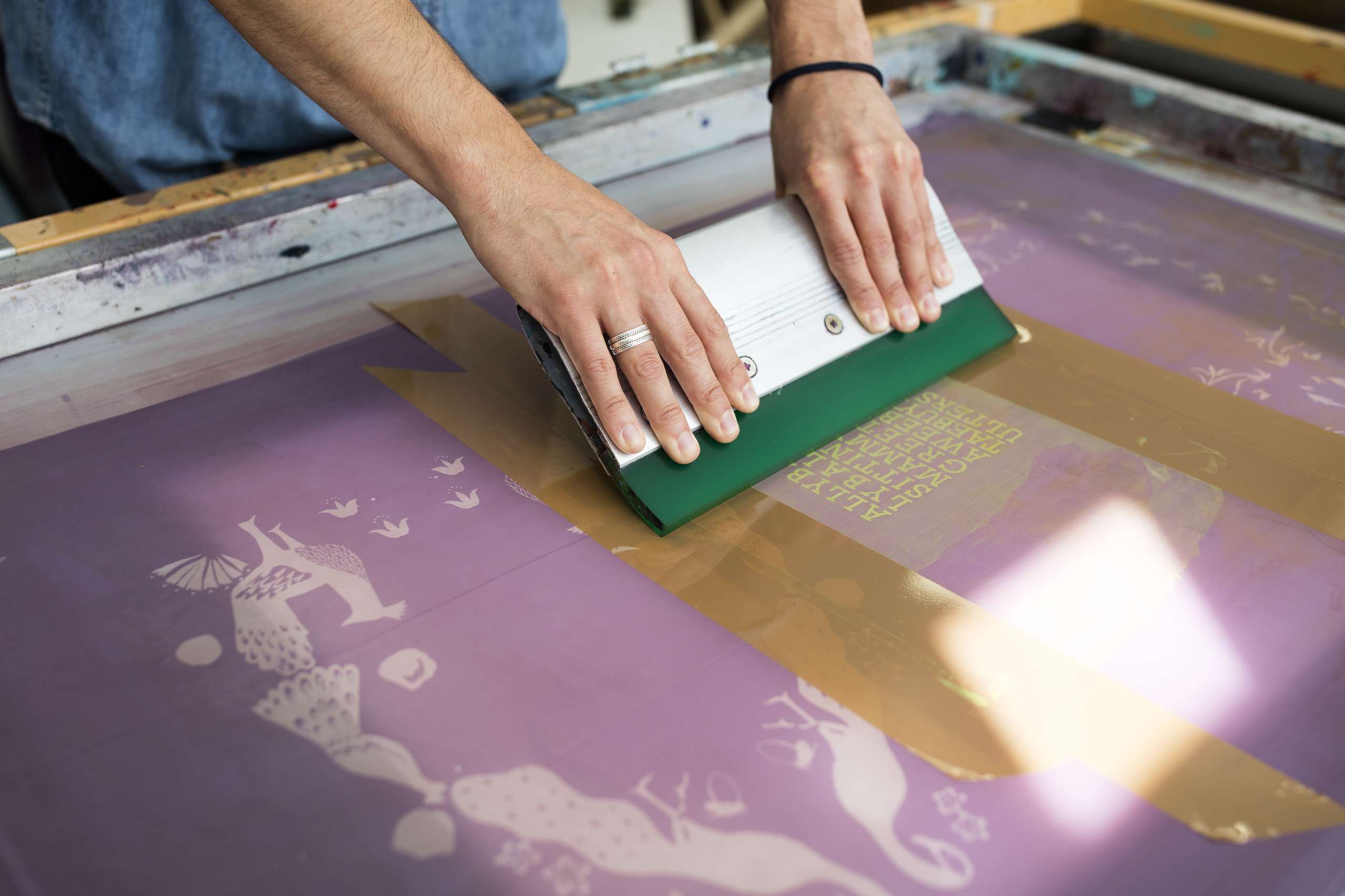
The most liberating color monotypes are made in a single pass, with multiple colors rolled directly onto the same plate, sometimes blending, sometimes colliding. No masks. No second chances. One sheet of paper, one roll through the press, one image that will never repeat.
Here is the method that changed everything for generations of artists who were afraid of color:
- Choose three colors that feel like a mood, not a plan. (Example: deep indigo, bruised violet, and a reckless cadmium red.)
- Roll each color in loose, irregular bands across the plate—no need for neat blocks.
- Let the brayer kiss the edges so colors graze and mix where they meet.
- Work into the wet surface quickly: subtract with rags, add accents with fingertips, scratch veins of light.
- Do not overthink harmony. Trust vibration over matching.
- Lay the paper and pull.
What emerges is rarely predictable. Reds cool into plum shadows. Yellows catch fire where they touch green. A streak of untouched white paper becomes lightning. The print feels like it was born in a storm.
This approach teaches three truths no color wheel ever could:
- Complementaries do not need to be placed opposite each other; they only need to touch once.
- Mud is not failure; it is earth. Use it for depth.
- The most singing color is often the one you almost left out.
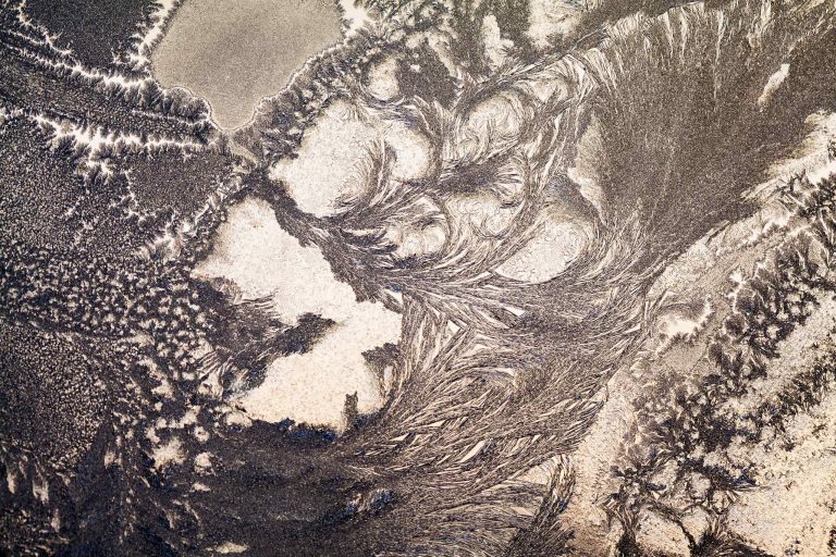
Advanced variation: the “rainbow roll” Load a single brayer with two or three colors side by side. Roll in one direction, then perpendicular, then diagonally. The plate becomes a shifting galaxy. Draw into it while everything is still slippery. The resulting print carries movement even when the subject is still.
A quiet exercise for skeptics:
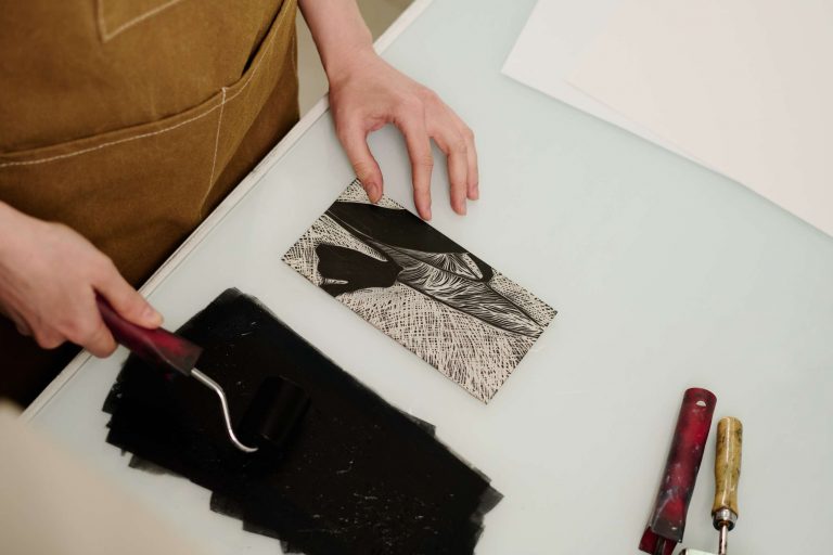
Take the ugliest leftover inks from previous sessions—those murky browns and sickly greens no one wants. Blend them loosely on the plate. Subtract a simple shape: a circle, a horizon, a figure. Pull the print.
Nine times out of ten, the rejected colors will resolve into something luminous and strange. Color has its own forgiveness.
The great gift of single-pass color monotype is that it returns childlike pleasure to the studio. You stop curating and start discovering. The plate becomes a place where colors misbehave in the best possible way.